Kibana Report Examples
With Simflofy's Kibana set up you will be able to report on the dates of yor documents. Following are examples of how to set up a few different report structures and visualizations and add them to a beautiful dashboard where you can easily view what's going on with your files.
Examples:
- Last Modified Date Vertical Bar Chart
- File Length Pie Chart
- Content Type Horizontal Bar Chart
Once your data is indexed you will follow these 3 easy steps to create a beautiful easy to read view of your data.
Set Up Reports
1. Create a Discovery Query
You can easily query your indexed data to create visualizations.
- Select Discover from the navigation pane on the left.
- Select the index pattern that you want to use in this Discovery report.
- Select the fields you want to run a query on.
- Click on the Visualize button.
Click here for more information on Kibana Discovery
2. Create a Visualization
- Clicking the visualize button will take you to a visualization page where you can now begin to customize how the data is displayed. You can set date and time filter,select if you want them displayed ascending or descending and other filters.
- Once you are satisfied with your visualization query click the save button and name your query.
Click here for more information on Kibana Visualizations
To view your new visualization select the Visualize button in the navigation menu.
Select your saved visualization to continue to make changes or go to the next step to create a Dashboard where you can add this new visualization.
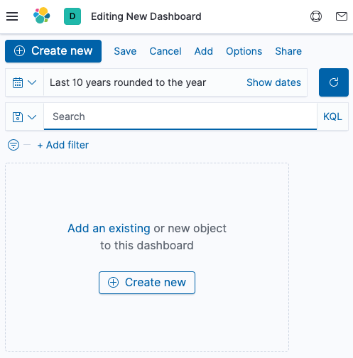
3. Create a Dashboard
Now you can add your new visualization to a dashboard where you can view all of your queries in a beautiful layout and set it up to give you real time results for what's going on with your data.
- Click on Dashboards from the navigation pane.
- Click the Create Dashboard button
- Click the words Add an existing to add your saved visualization
- Select your saved visualization
- Resize your visualization if needed
- Click save and name your new dashboard
- Follow these steps to continue to add other queries you have created
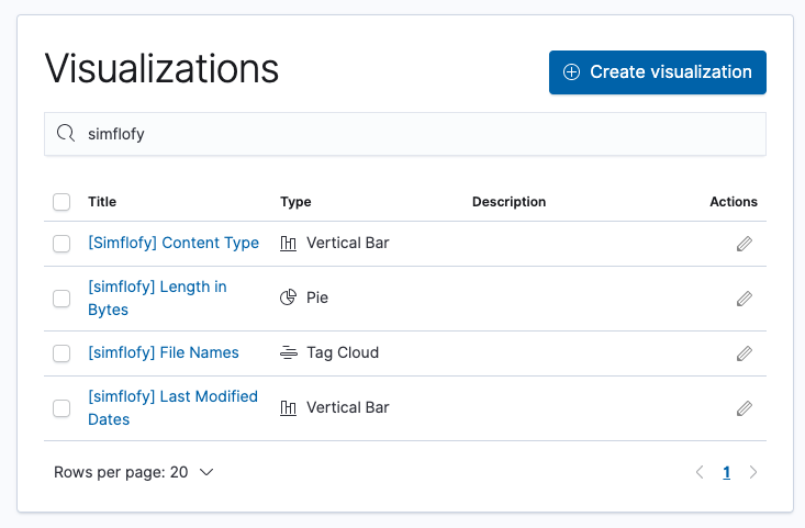
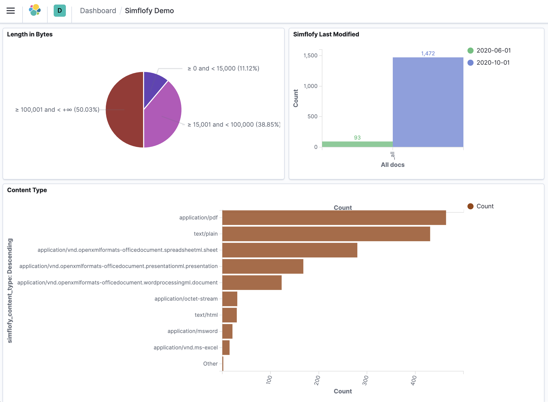
Simflofy Report Examples
Following are examples for the simflofy demo dashboard pictured throughout this training guide
Simflofy Dashboard Example
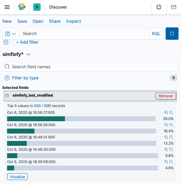
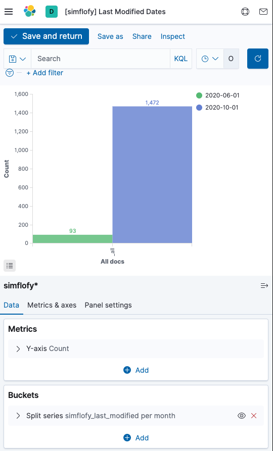
Last Modified Date Vertical Bar Chart
This visualization example displays the count of dates that the files that were modified on by month.
To create this visualization:
- In the Discovery select the last modified date field
- Saved the query and title it Last Modified Date
- Click on Visualize from the navigation
- Select the create visualization button
- Select Vertical Bar as the chart type
- Select your saved query
- In the bucket section click the add button
- Select split series from the drop-down
- Select Histogram from the Aggregation Drop down
- Select Last Modified Date for the field drop down
- Select Monthly for the interval period
- Click Save and name this visualization, so you can add it to the Dashboard.
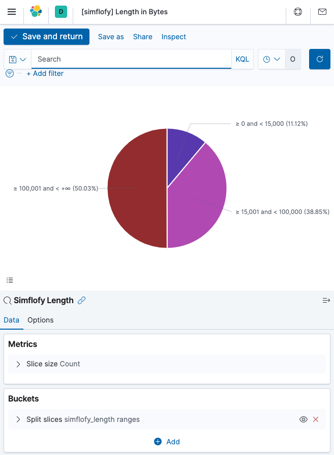
File Length Pie Chart
This visualization example displays the count of files in your index
To create this visualization:
- In the Discovery select the simflofy_length field
- Save the query and title it
- Click on Visualize from the navigation
- Select the create visualization button
- Select Pie as the chart type
- Select your saved query
- In the bucket section select range as the aggregation
- Select simflofy_length as the field
- Click Add range and add three ranges
- 0 - 15000
- 15001 - 100000
- 100000 - infinity
- Click save and title the visualization
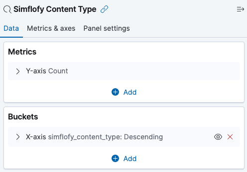
Content Type Horizontal Bar Chart
The visualization example below displays the count of the content type.
To create this visualization:
- In the Discovery select the simflofy_content_type field
- Save the query and title it
- Click on Visualize from the navigation
- Select the create visualization button
- Select Bar as the chart type
- Select your saved query
- Select Terms from the Aggregation field
- Select Descending from the order drop down
- Save this visualization and give it a name.