Kibana Visualizations
Visualize enables you to create visualizations of the data from your Elasticsearch indices, which you can then add to dashboards for analysis.
Kibana visualizations are based on Elasticsearch queries. By using a series of Elasticsearch aggregations to extract and process your data, you can create charts that show you the trends, spikes, and dips you need to know about.
To begin, open the menu, go to Visualize, then click Create visualization.
Kibana supports several types of visualizations. The most frequently used visualizations are:
- Line, area, and bar charts: Compares different series in X/Y charts.
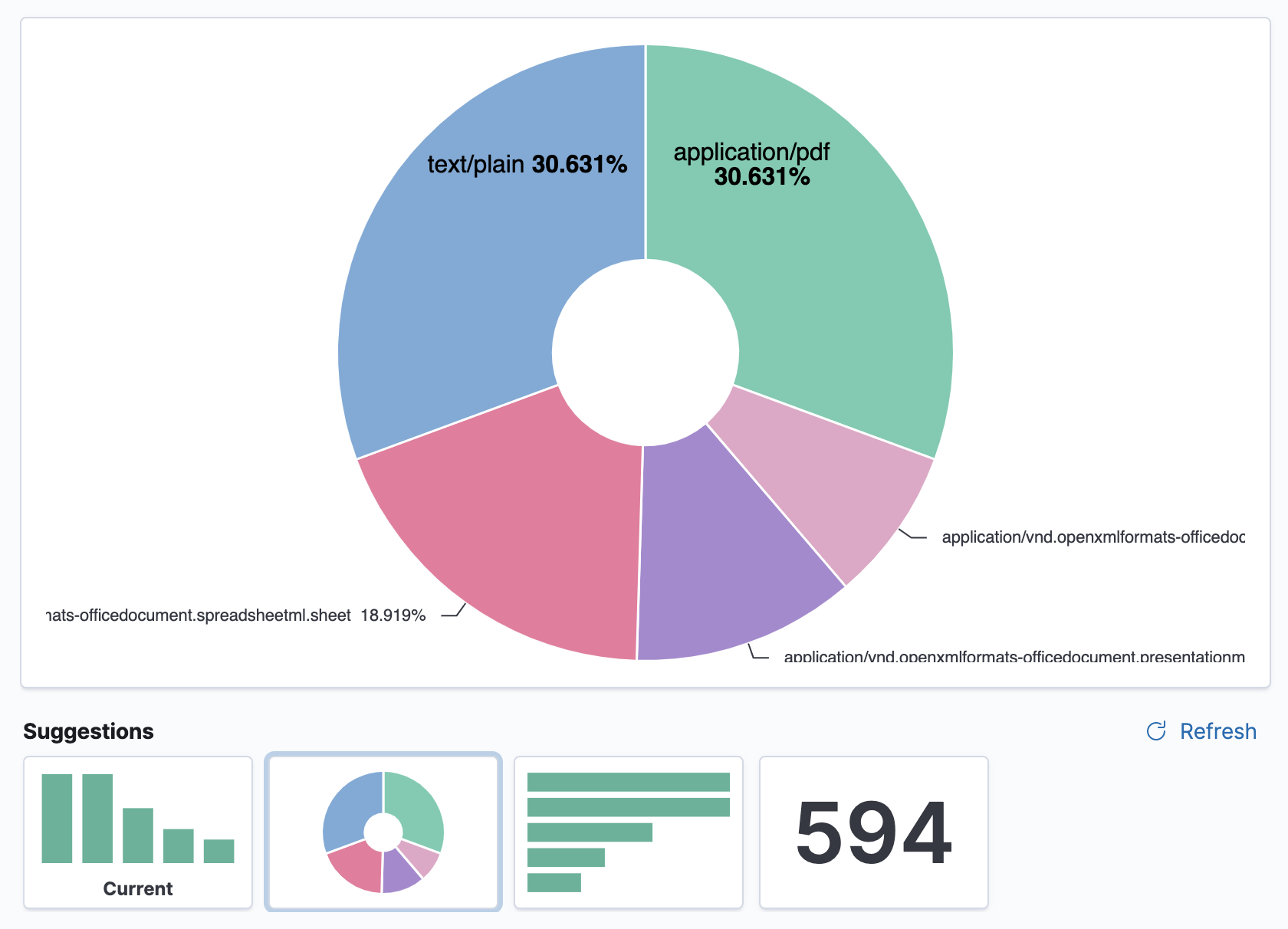
- Pie chart: Displays each source contribution to a total.
- Data table: Flattens aggregations into table format.
- Metric: Displays a single number.
- Goal and gauge: Displays a number with progress indicators.
- Tag cloud: Displays words in a cloud, where the size of the word corresponds to its importance.
Visualization Examples
Lens Visualization
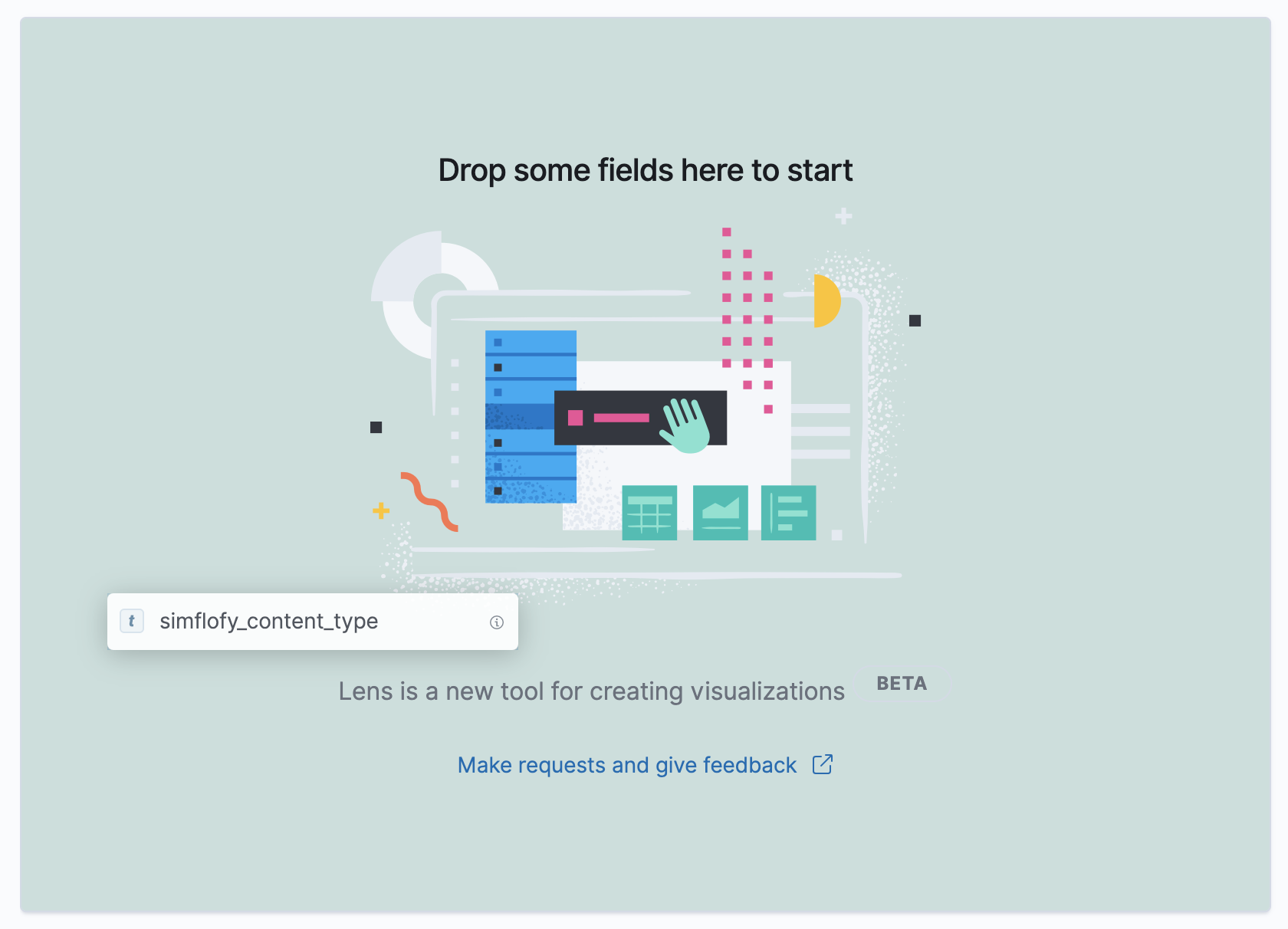
The Lens visualization is a simple and fast way to create visualizations of your Elasticsearch data. To create visualizations, you drag and drop your data fields onto the visualization builder pane, and Lens automatically generates a visualization that best displays your data.
With Lens, you can:
Use the automatically generated visualization suggestions to change the visualization type. Create visualizations with multiple layers and indices and add your visualizations to your dashboards for a professional view of your metrics.
Data Summaries
To help you decide exactly the data you want to display, get a quick summary of each field. The summary shows the distribution of values within the selected time range.
To view the field summary information, navigate to the field, then click i.
To get started with Lens, select a field in the data panel, then drag and drop the field on a highlighted area.
You can incorporate many fields into your visualization, and Lens uses heuristics to decide how to apply each one to the visualization.
- Drag-and-drop capabilities are available only when Lens knows how to use the data. If Lens is unable to automatically generate a visualization, you can still configure the customization options for your visualization.
Visualization Type
Lens enables you to switch between any supported visualization type at any time.
Suggestions are shortcuts to alternate visualizations that Lens generates for you.
If you'd like to use a visualization type that is not suggested, click the visualization type, then select a new one.
When there is an exclamation point (!) next to a visualization type, Lens is unable to transfer your data, but still allows you to make the change.
Change the data panel fields
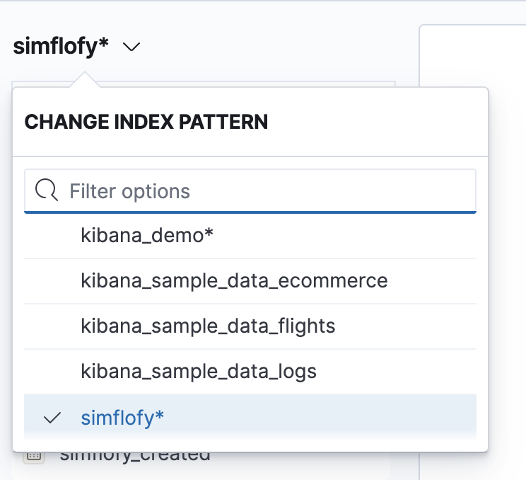
The fields in the data panel are based on the selected index pattern and time filter.
To change the index pattern, click it, then select a new one. The fields in the data panel automatically update.
To filter the fields in the data panel:
- Enter the name in Search field names.
- Click Filter by type , then select the filter. To show all the fields in the index pattern, deselect Only show fields with data.
Change the aggregation and labels
For each visualization, Lens allows some customizations of the data.
Click Drop a field here or the field name in the column.
Change the options that appear. Options vary depending on the type of field.
Add layers and indices
Area, line, and bar charts allow you to visualize multiple data layers and
indices so that you can compare and analyze data from multiple sources.
To add a layer, click +, then drag and drop the fields for the new layer.
Next Step: Set up and organize the dashboard